A museum, renovated, expanded and re-branded
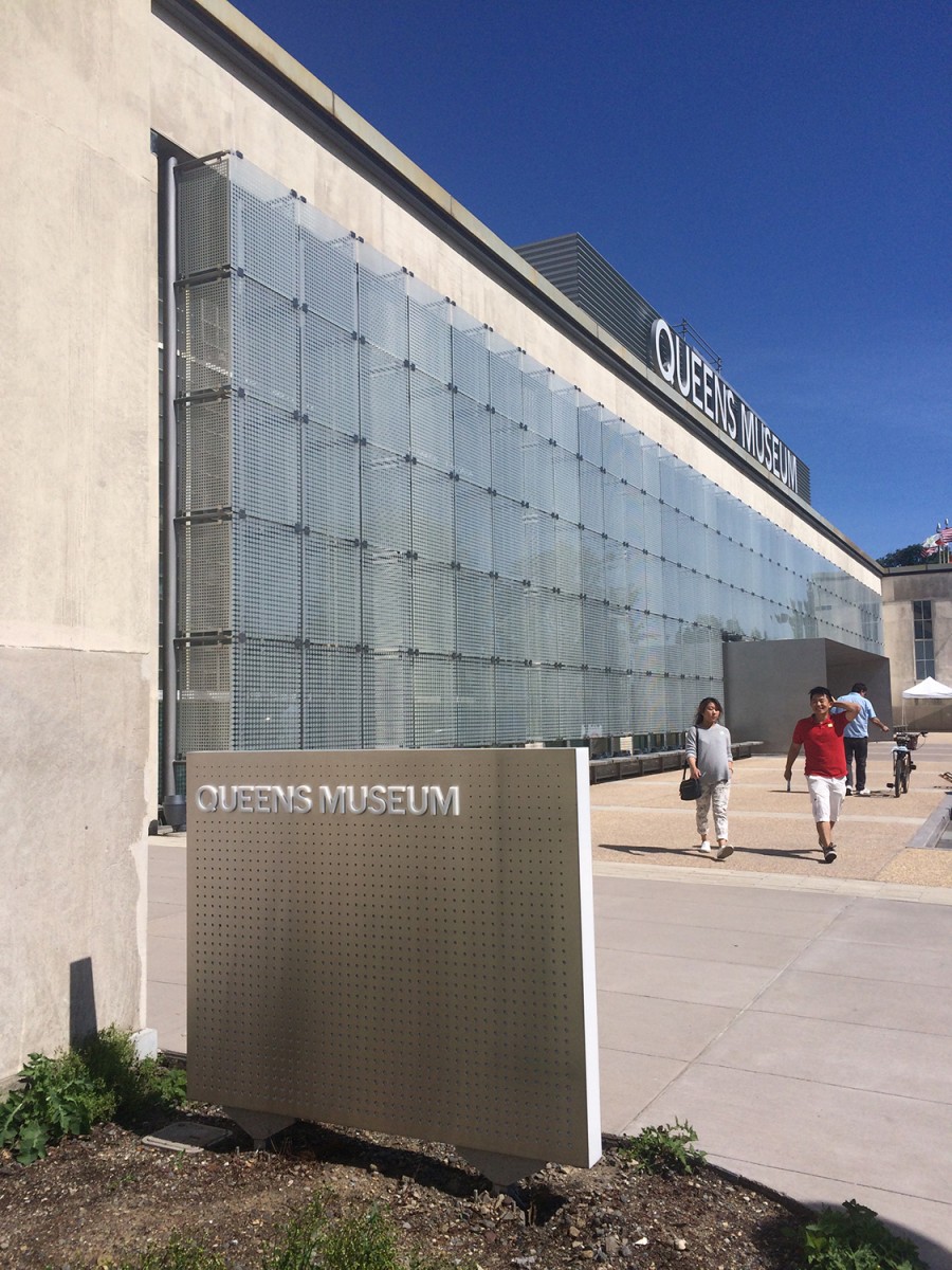
Between 2007 and 2015, the Queens Museum has undergone a $68m renovation and expansion, as part of a New York Department of Design and Construction capital program. The building is historic: Host to the first General Assembly before the UN moved to Niemeyer’s HQ on 1st Avenue, it later served as the New York Pavilion during the 1964 World’s Fair. Today, still housing Robert Moses’ famous scale model of the five boroughs, it continues to thrive as a hub for the most diverse neighborhood in the United States, with an international diaspora of affiliated artists, civil actors and educators.
Brand identity research and wayfinding strategy
During the concept phase, to accompany plans for the building’s facelift, Grimshaw Architects invited Constellation (The Map Office, Alex Lin Design and Turnstone Consulting) to design graphics for the external (west wall) facade, and develop a strategy for the museum’s exterior way-finding.
At the same time, to raise awareness of the museum’s local, national and international influence and raise attendance from a variety of audiences, the Museum also asked us to refresh their visual identity to represent them, now and next, to invigorate its branding across all printed, digital and environmental media.
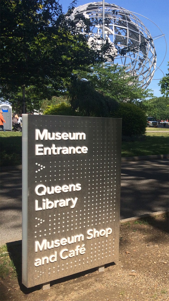
For the wayfinding strategy, Turnstone developed a coordinated set of exterior signage that provides directional, informational and programmatic content to help visitors arriving on foot through Flushing Meadows, and drivers arriving off the Grand Central Parkway to orient, navigate and approach the museum entrances with confidence.
For the brand strategy, Turnstone led comprehensive interviews with over 30 stakeholders associated with the museum, gathering experiences and opinions from senior and operations staff, educators, curators, new New Yorkers, parents of children attending workshops, benefactors and artists in residence. A standout interview was with the Principal of the Island Academy, the educational facility at Rikers Island jail; he sends his staff to QMA for art therapy each year.
A clear creative brief, well-executed
With a 360˚ understanding of the museum’s operations, and value to its many constituents in the arts, education and local community life, we were able to synthesize the input we’d received and come up with a brand architecture: A vocabulary to describe (and visualize) what the institution stood for, and where it’s going – something meaningful now and aspirational (and still relevant and attainable) for its renovated, expanded future.
“You nailed it”, declared David Strauss, Deputy Director of the Museum, when we presented the brand strategy to the museum’s senior staff in mid-2008. From 2009, as partner at Pentagram, Constellation’s Eddie Opara took forward the branding and the wayfinding forward into the design phase to completion in 2015.
As a direct outcome of our strategic recommendations, the museum’s name was abbreviated – offering so much more than art-related programming, it is now simply known as Queens Museum. The three columns of the logomark not only reflect the architecture and plurality of its visitors, but three kinds of patrons: older Queens locals, new New Yorkers, international artists and tourists.
Fast forward to 2015
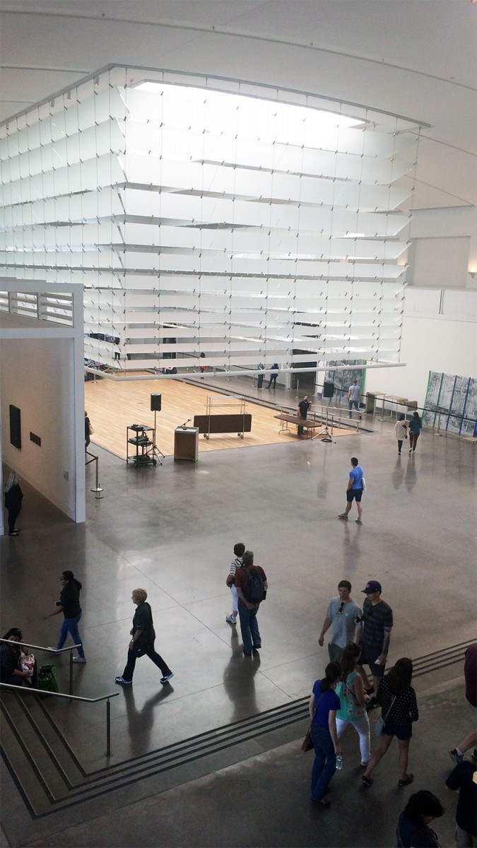
What visitors experience at the museum today is an expression of what’s possible when the City collaborates with world-class architects and designers to elevate civic spaces for everyday New Yorkers: At the scale of MOMA’s PS1, it has more gallery space, more interior light, clear, consistent interior and exterior wayfinding and beautiful printed collateral. The Museum’s Director has since become the New York Commissioner for the Department of Cultural Affairs.


